O Sh
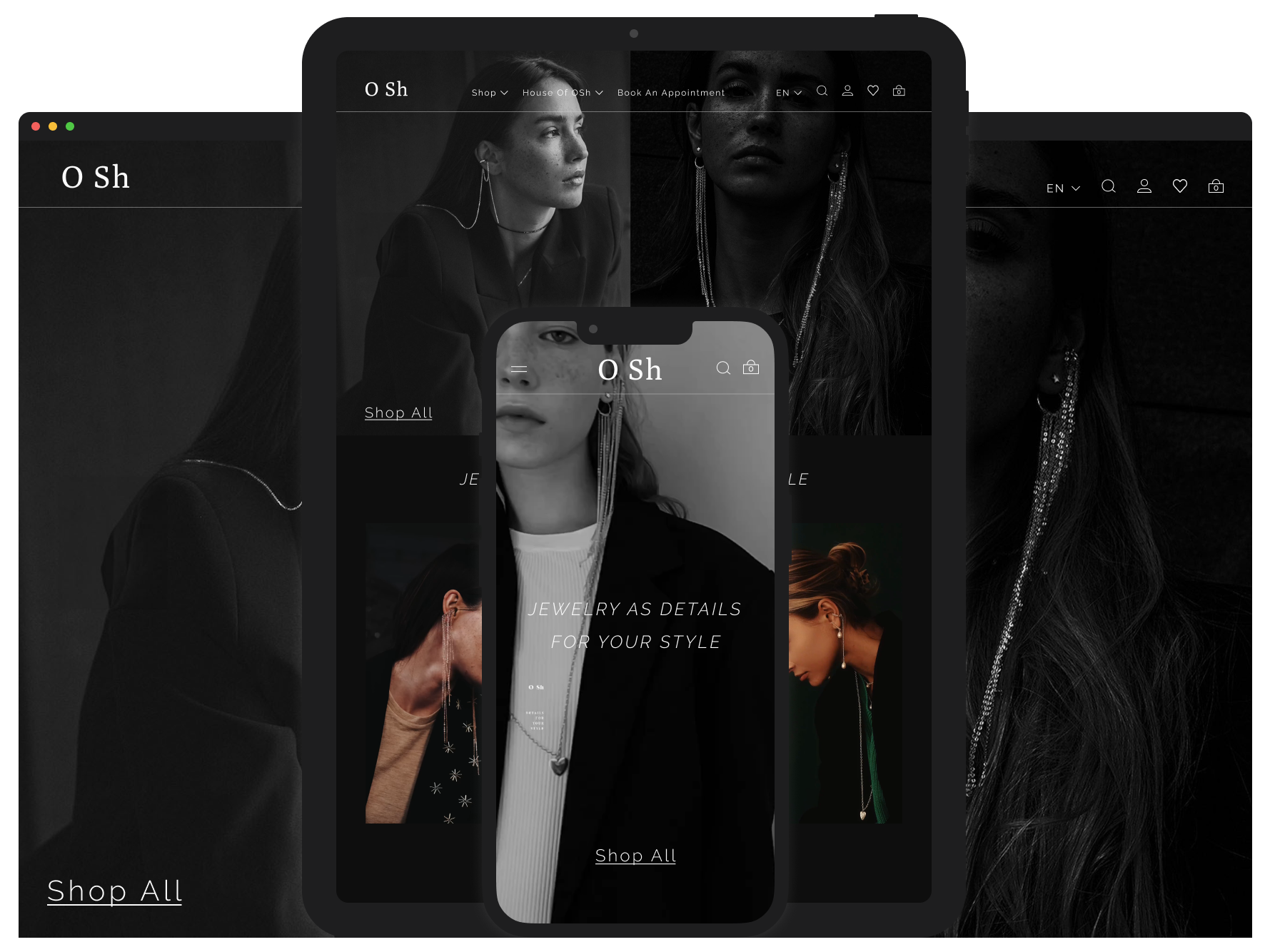
Overview: Jewelry responsive website design.
Tasks: UI design, Prototyping
Tools: Figma
Overview
In this case study, I undertook the project of redesigning a jewelry store's website to enhance its visual appeal, user experience, and overall performance. The original site suffered from an outdated design, poor navigation, non-responsiveness, inconsistency, and slow loading times. Through a comprehensive redesign process, I aimed to address these issues by implementing a modern and luxurious visual design, improving navigation, ensuring responsive functionality, maintaining a consistent design language, and optimizing performance. This case study outlines the problems identified, the solutions implemented, and the design process followed to achieve a successful website redesign.
Current website analysis

Problem
The current website of the jewelry store has several issues that hinder user experience and business performance:
Outdated Design: The visual design is not appealing and doesn't reflect the luxury and elegance of the jewelry brand.
Poor Navigation: Users find it difficult to navigate through the website to find products or information.
Non-Responsive Design: The website is not optimized for desktops, leading to a poor user experience on desktops and tablets.
Lack of Consistency: There is inconsistency in the design elements, typography, and color scheme, making the site look unprofessional.
Redesign objectives
To address the identified issues, the following solutions were implemented:
Modern Visual Design: Introduced a sleek, modern design that conveys luxury and elegance, aligning with the brand identity.
Enhanced Navigation: Redesigned the navigation structure to be more intuitive and user-friendly, allowing users to find what they need easily.
Responsive Design: Created a responsive design that ensures optimal user experience across all devices, including desktops, tablets, and mobile phones.
Consistent Design Language: Established a consistent design language with a coherent typography and color scheme to enhance the professional look of the site.
Design Process
Moodboard
Inspiration: Collected visual inspirations that align with the desired luxury and elegance of the brand. The moodboard includes images that reflect the style, color palette, and overall aesthetic direction for the redesign.

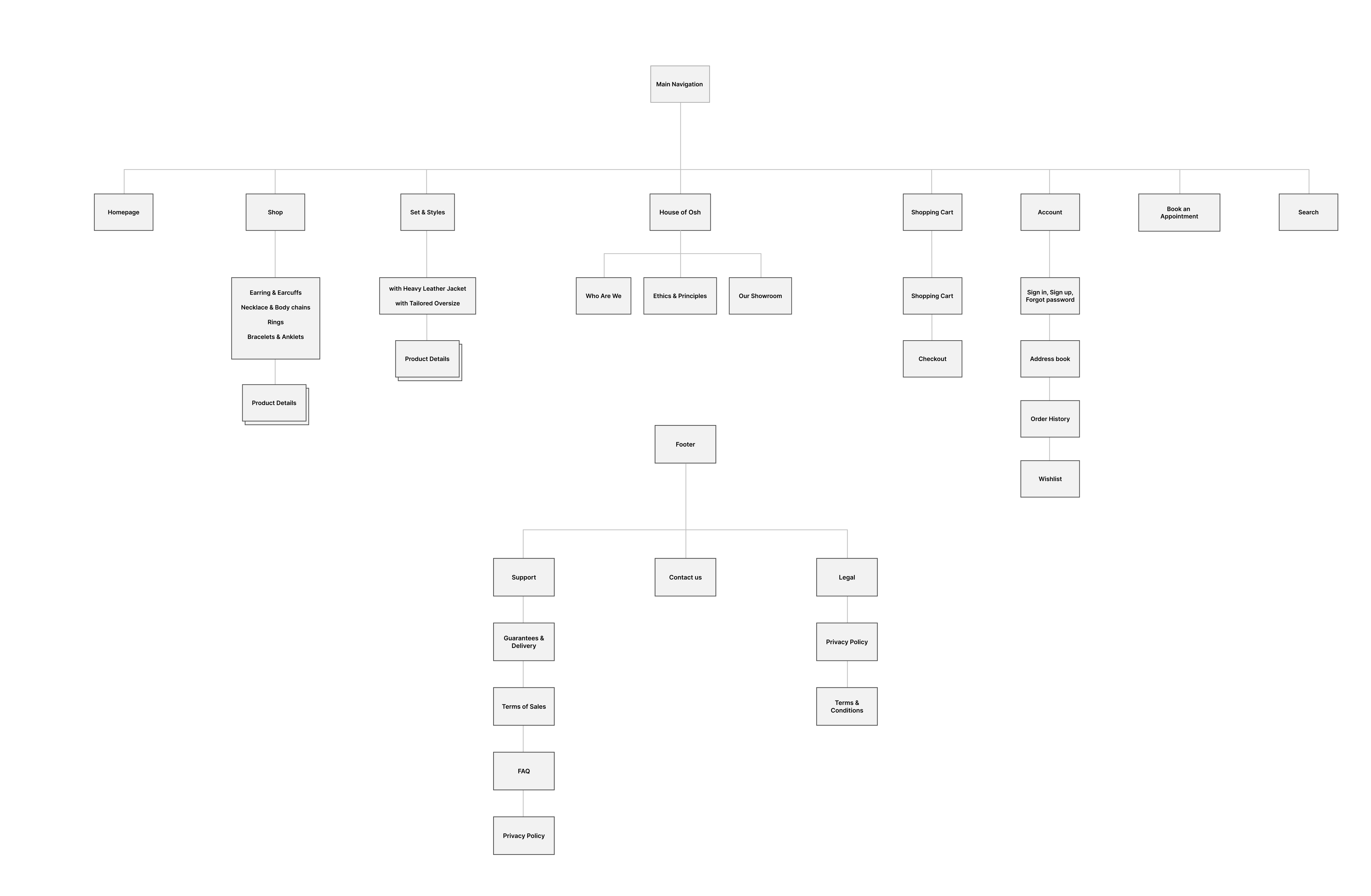
Sitemap
Structure Planning: Created a sitemap to plan the structure of the website, ensuring a logical flow and easy navigation for users.
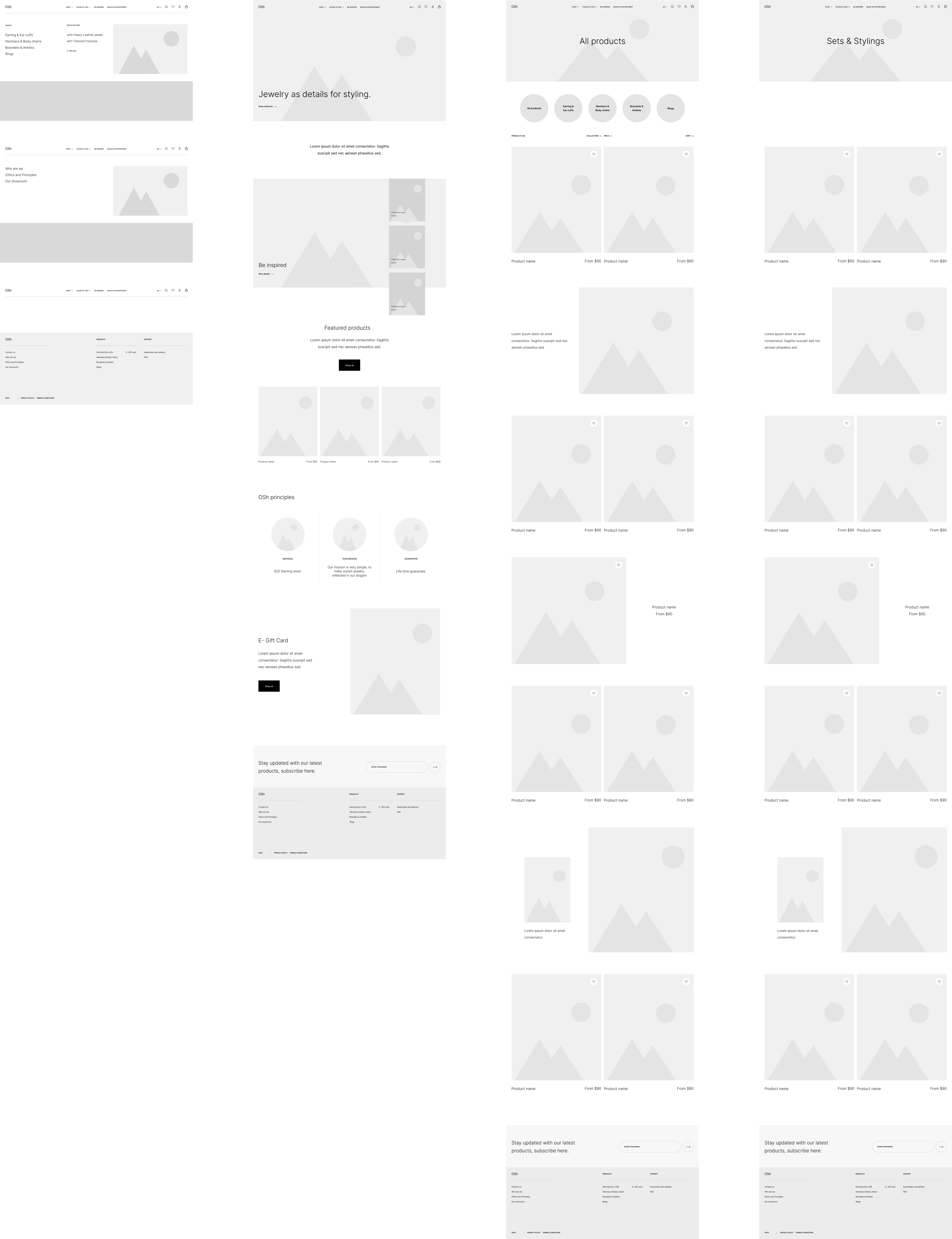
Wireframes
Developed low-fidelity wireframes to outline the basic layout and structure of the pages, focusing on functionality and user flow.
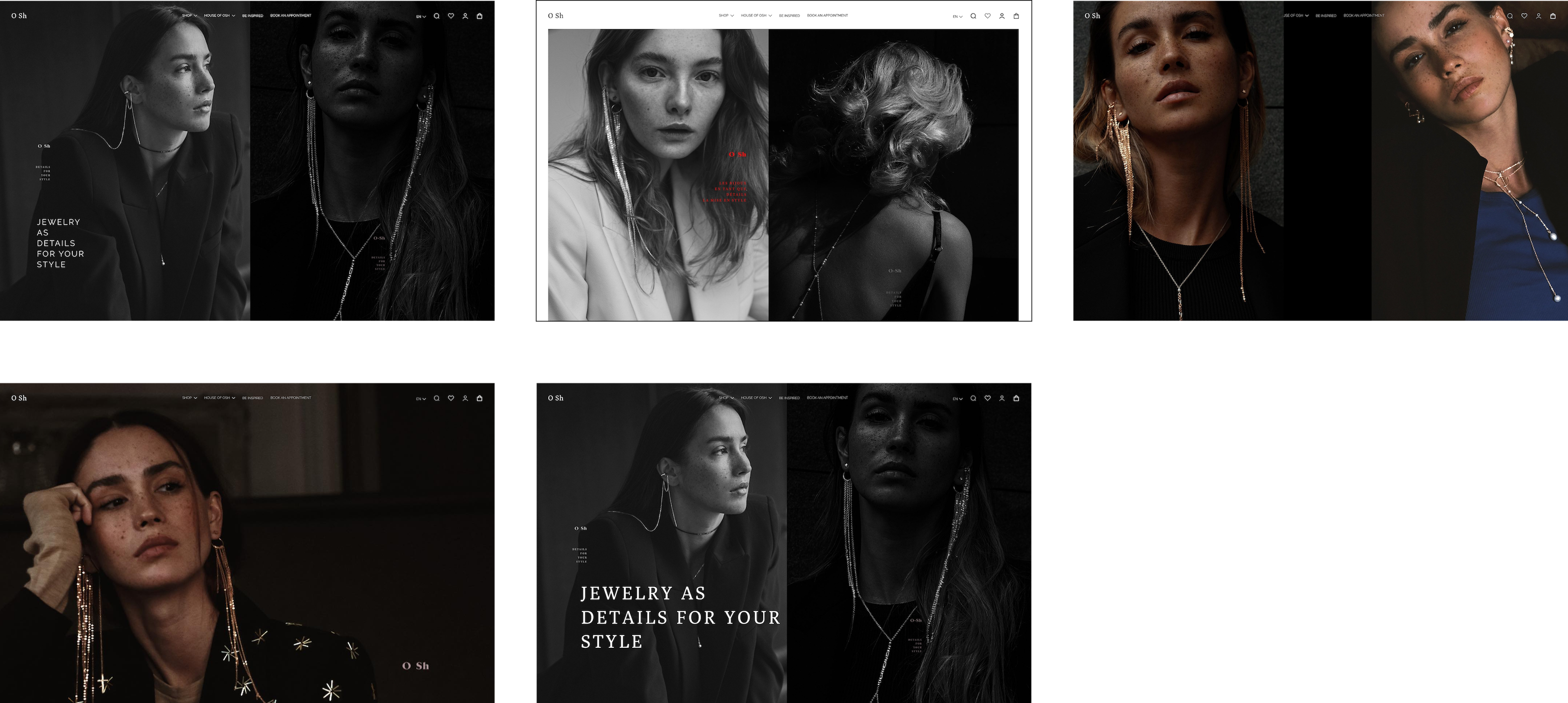
Art direction
Imagery and Photography: Selected high-quality images that resonate with the brand's luxurious feel and enhance the visual appeal of the website.
Style guide
Typography: Selected fonts that complement the brand's luxurious image and ensure readability across different devices.
Color Scheme: Chose a color palette that reflects the brand's identity and creates a visually appealing contrast.
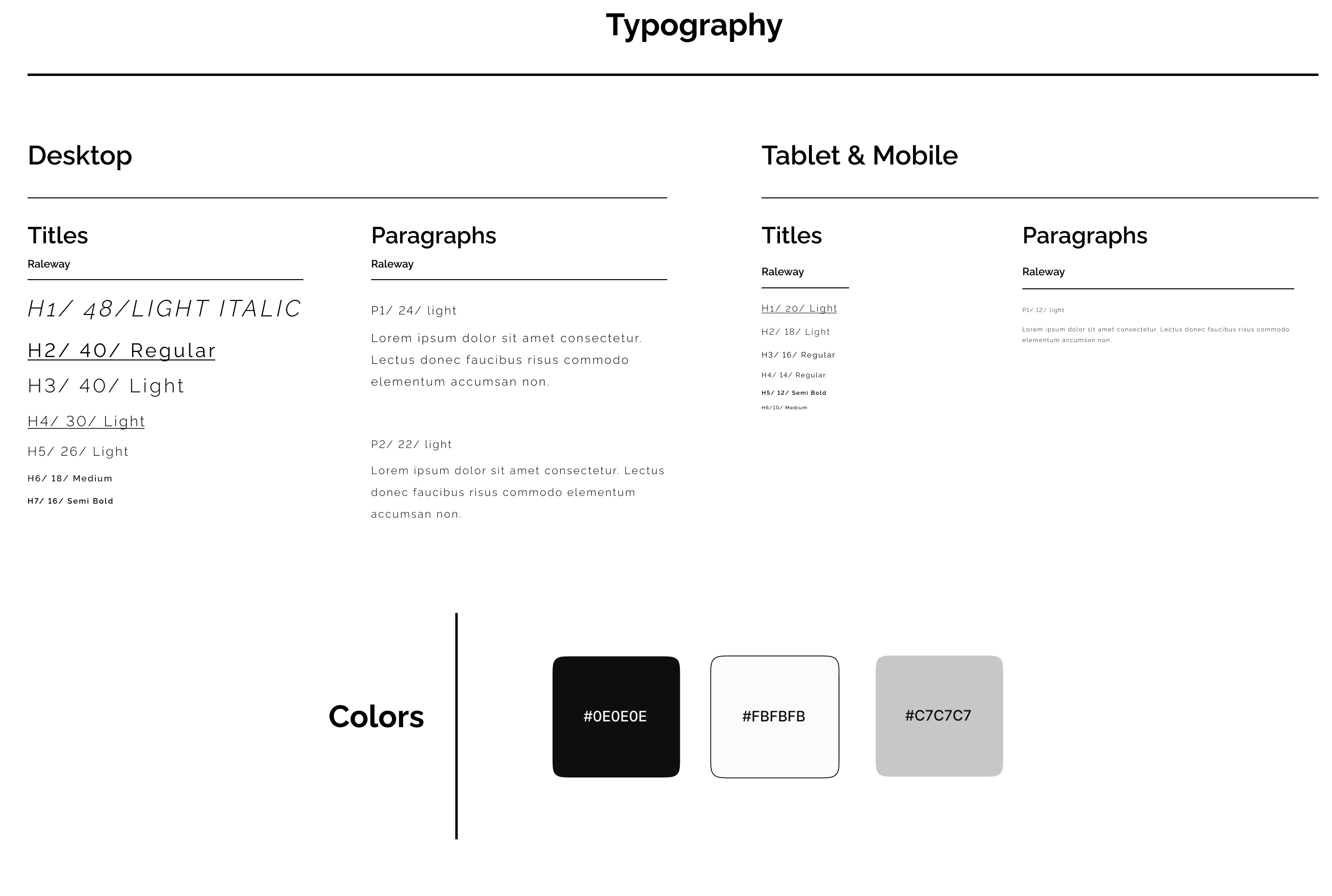
Components: Defined reusable UI components to maintain consistency across the website.
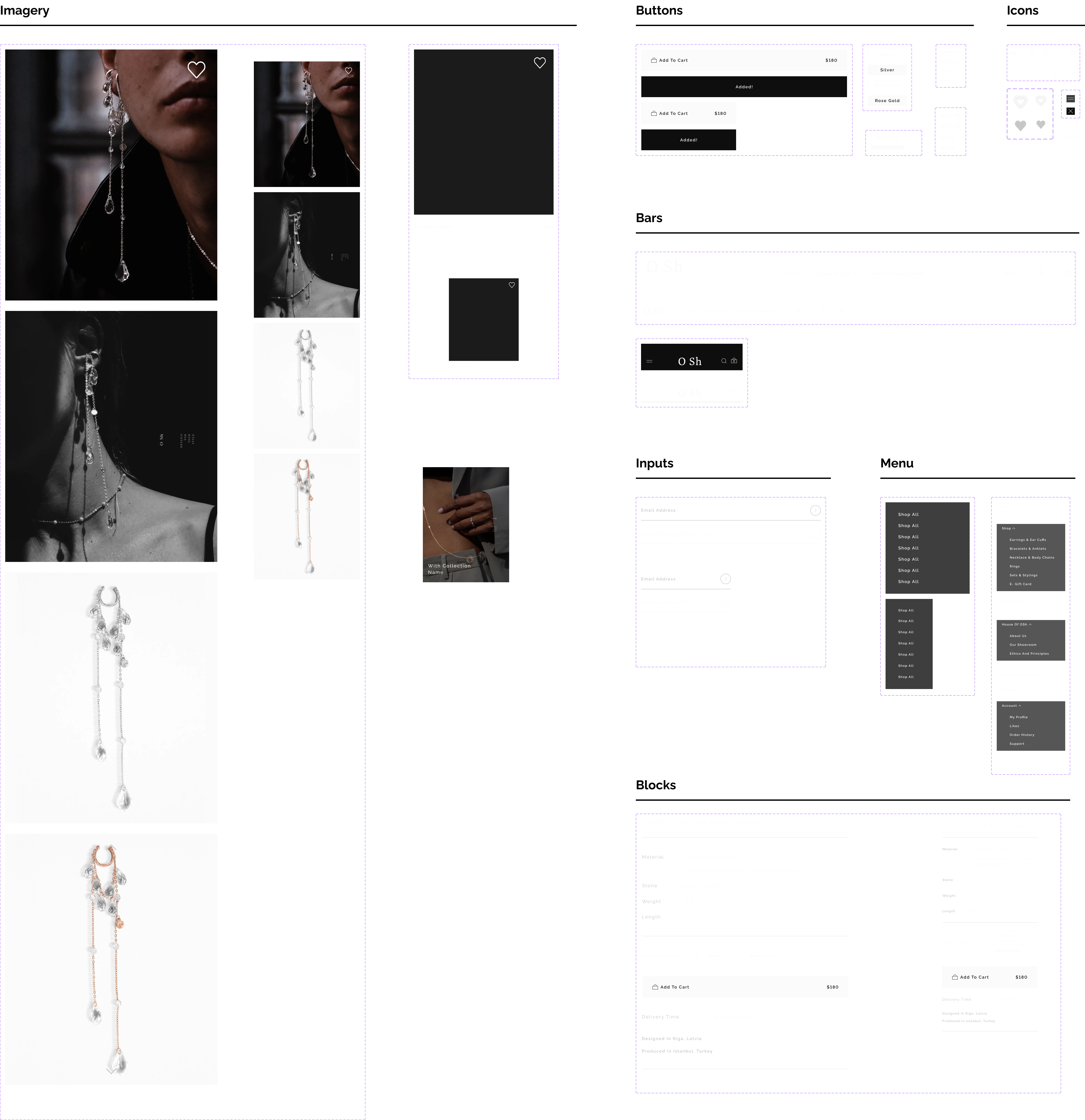
Hi-Fi wireframes
Refined the wireframes into high-fidelity versions, incorporating detailed design elements and visual components.

Responsive design & Prototyping
Desktop: Designed desktop versions of the key pages, ensuring an optimal user experience.

Navigation
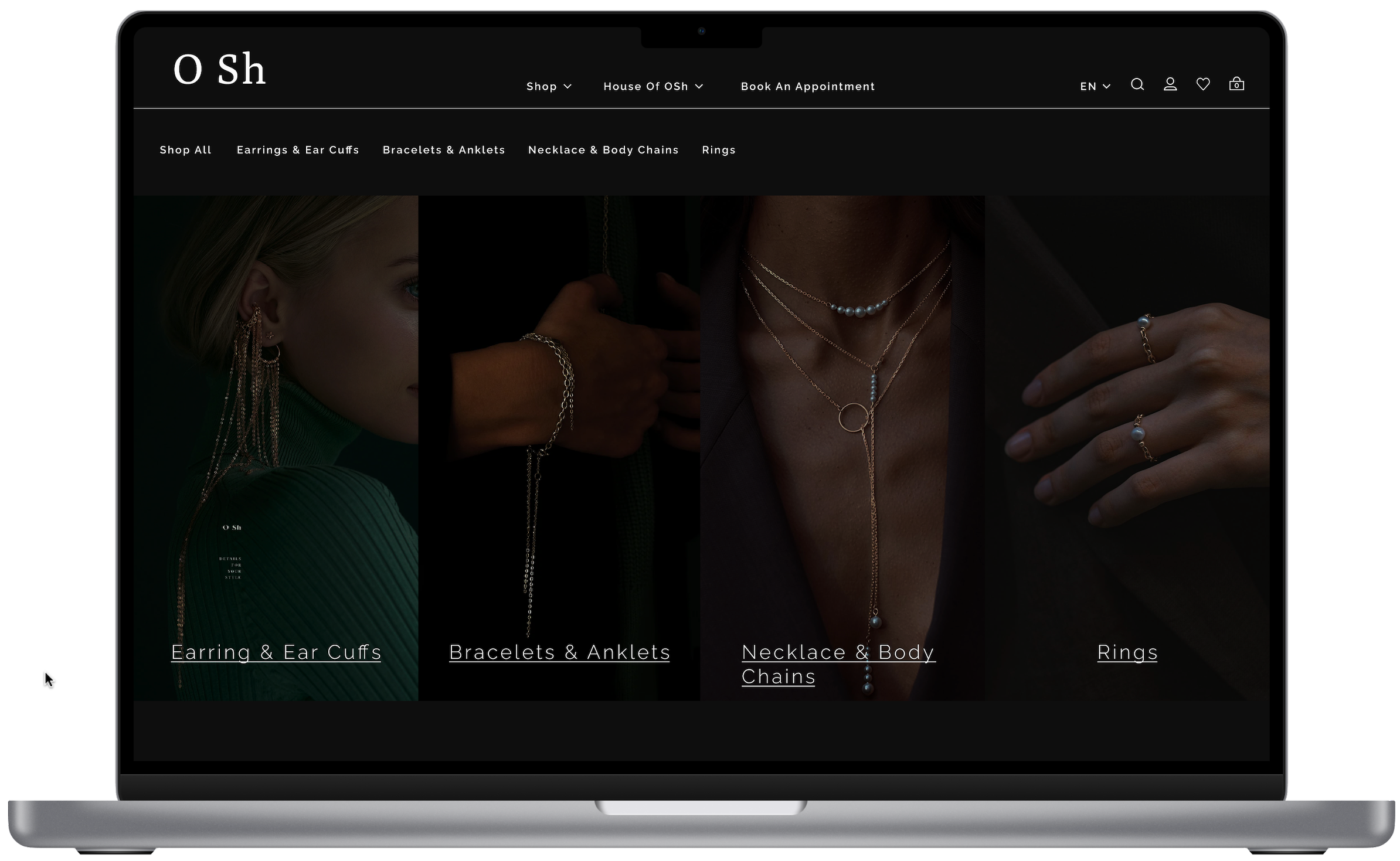
The desktop navigation for the website is designed to be clear, concise, and visually appealing. Key features include:
1. Top Navigation Bar: The navigation bar is positioned at the top of the page, providing easy access to the main categories. It uses a clean, minimalistic design to maintain focus on the luxurious brand imagery.
2. Dropdown Menus: Hovering over the main categories (e.g., "Shop," "House of OSh") reveals dropdown menus that list subcategories and additional options. This allows users to quickly access specific sections without overwhelming them with too many choices at once.
- Shop: Includes subcategories such as "Earrings & Ear Cuffs," "Bracelets & Anklets," "Necklace & Body Chains," "Rings," "Sets & Stylings," and "E-Gift Card."
- House of OSh: Contains information about the brand, such as "About Us," "Our Showroom," and "Ethics and Principles."
3. Utility Icons: Icons for search, user account, wishlist, and shopping cart are placed on the right side of the navigation bar, ensuring they are easily accessible without cluttering the main navigation.
4. Visual Consistency: The navigation menu uses a monochromatic color scheme, ensuring it blends seamlessly with the rest of the site while maintaining high readability and ease of use.

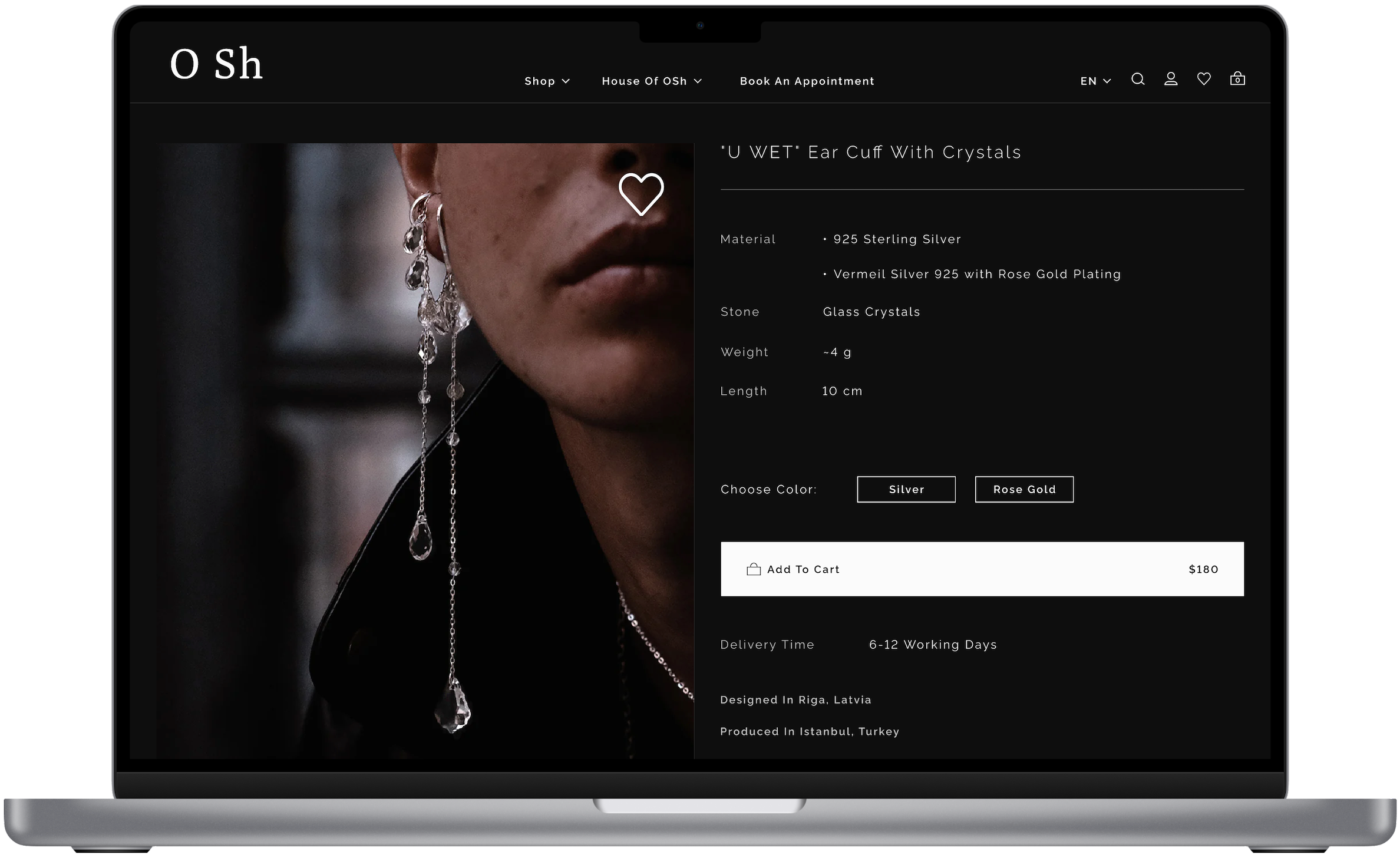
More details about the product, an option to choose the material, and a big high-contrasted call to action button, for a seamless and better shopping experience.
Tablet: Adapted the design for tablet screens, maintaining usability and visual appeal.

Mobile: Created mobile versions to ensure a seamless experience for users on smartphones.
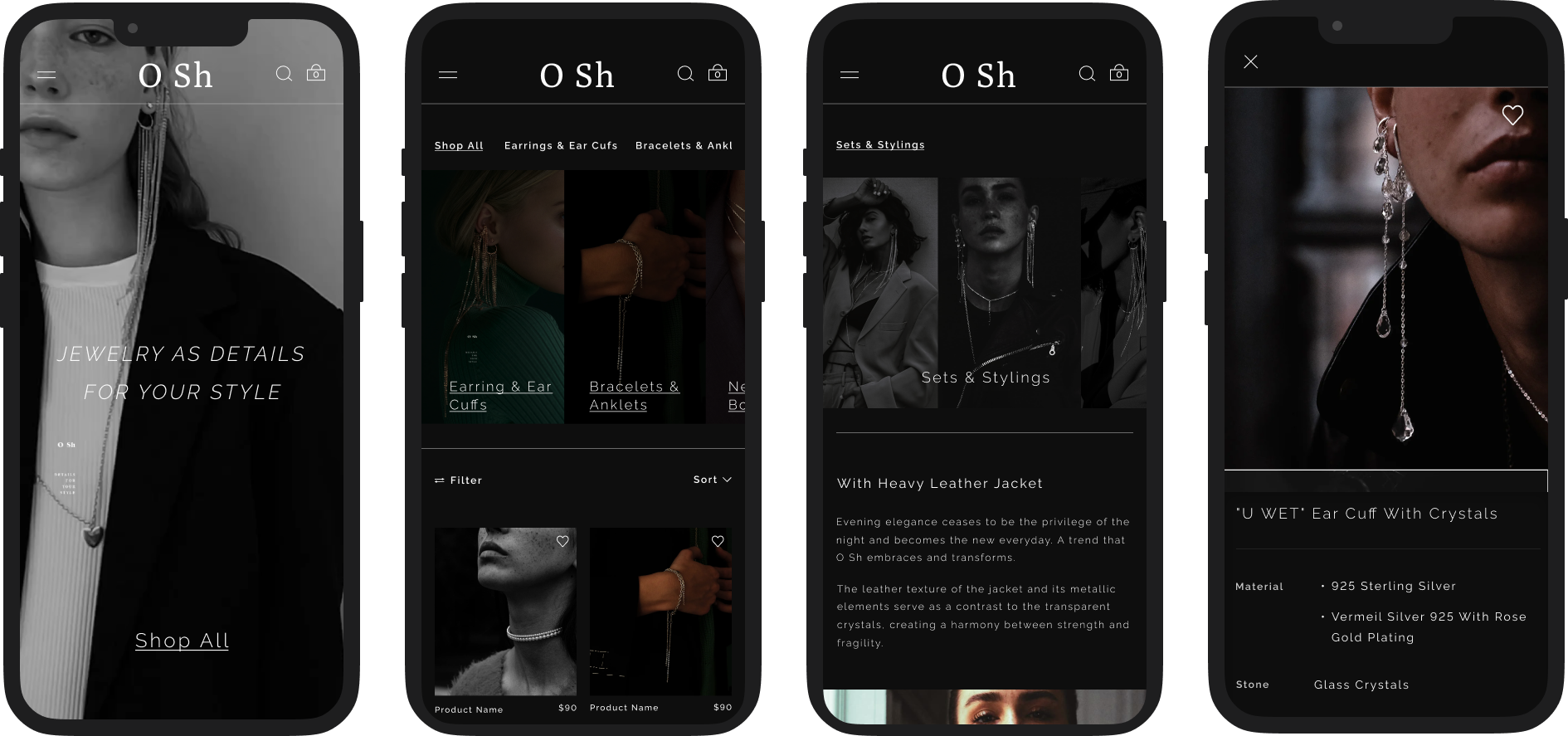
Mobile Navigation
The mobile navigation adopts a responsive, user-friendly accordion burger menu design to ensure seamless usability on smaller screens. Key features include:
Burger Menu Icon: Located at the top left of the screen, the burger menu icon opens the full navigation when tapped. This saves space on the screen and provides a clean look.
Accordion Menu: The menu opens as an accordion, displaying the main categories. Tapping on a category expands it to reveal subcategories, allowing users to navigate to their desired section easily without overwhelming the screen with too many options at once.
Utility Icons: Similar to the desktop version, icons for search, user account, wishlist, and shopping cart are easily accessible within the menu, ensuring users can quickly access these functions without having to navigate away from the menu.
Touch-Friendly Design: The mobile menu is designed with touch interactions in mind, featuring large tap targets and smooth transitions to enhance the user experience on mobile devices.
Mobile Homepage
Featured Products
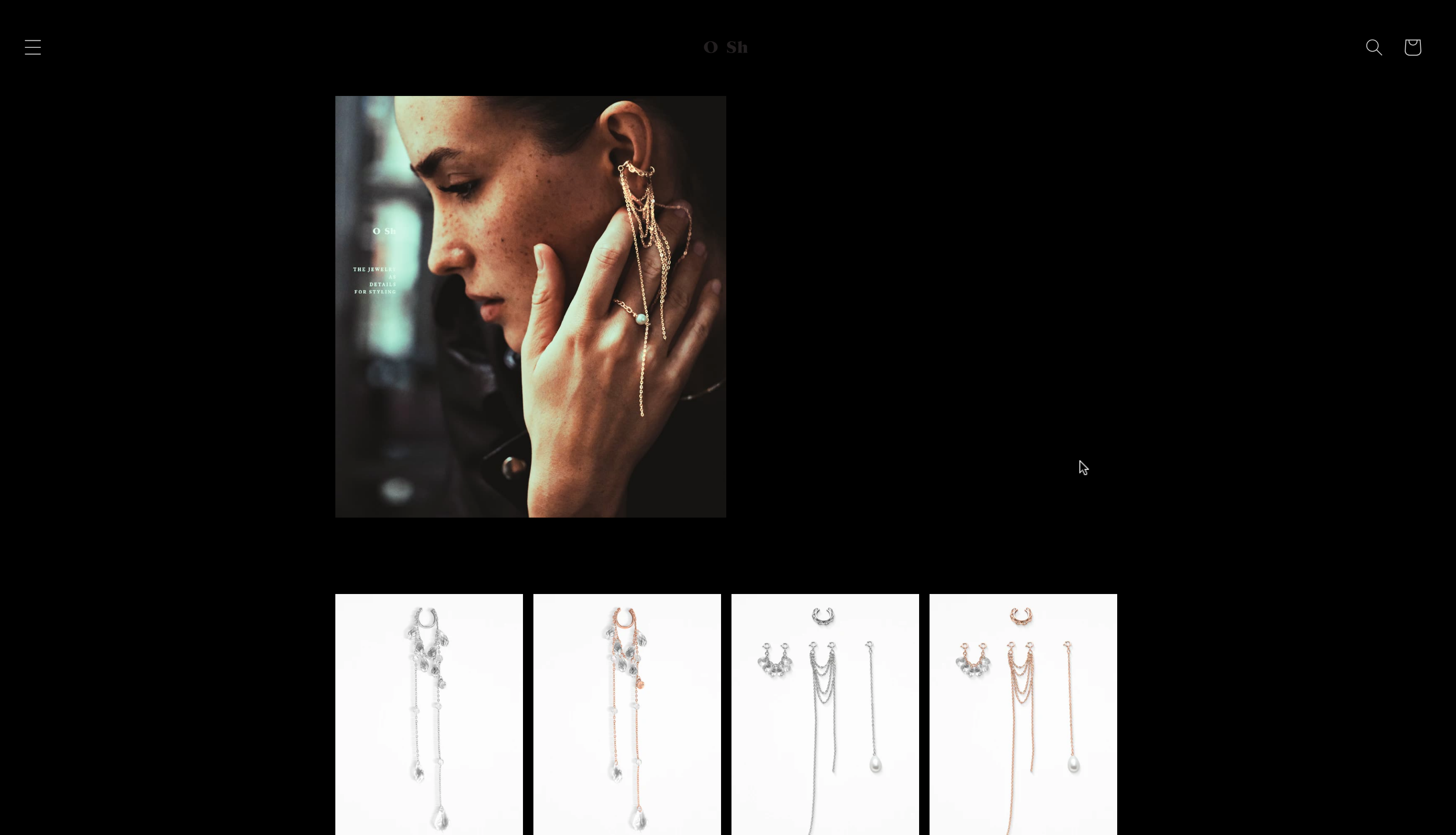
The homepage design for the mobile version of the website presents a refined and targeted approach to ensure a luxurious and functional user experience. Here's an overview of the key elements:
Hero Section: At the top, a striking hero image showcases the jewelry, complemented by a minimalist slogan "Jewelry as details for your style." This not only captures attention immediately but also positions the brand's products as essential fashion elements. The "Shop" call-to-action (CTA) button is prominently placed to encourage immediate engagement.
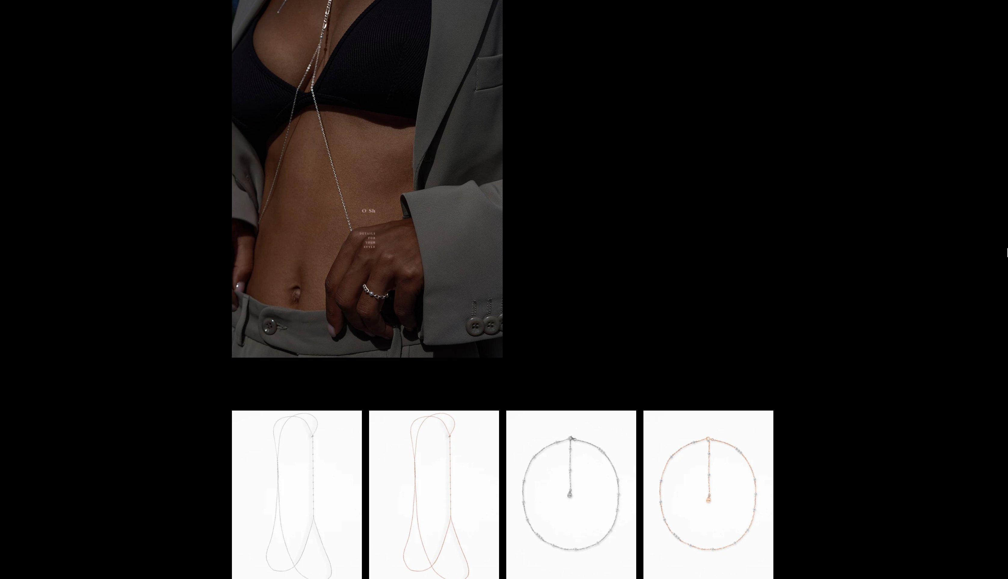
Product Highlight: Below the hero section, the design strategically places high-quality images of featured jewelry pieces. This section utilizes a clean layout that emphasizes the products' elegance without distraction.
Navigation Access: The hamburger menu icon remains visible at the top of every section, ensuring that navigation is accessible no matter how far a user scrolls. This supports a seamless exploration of the website.
Featured Products: This area showcases selected products with images that users can tap for more details or to directly add items to their wishlist or cart. Price tags and brief descriptions provide essential information at a glance.
E-Gift Card Promotion: Towards the middle of the homepage, there is a dedicated space promoting the e-gift card, which is a significant sales driver. The design here is sleek, with a compelling image and a brief text encouraging users to explore gift options.
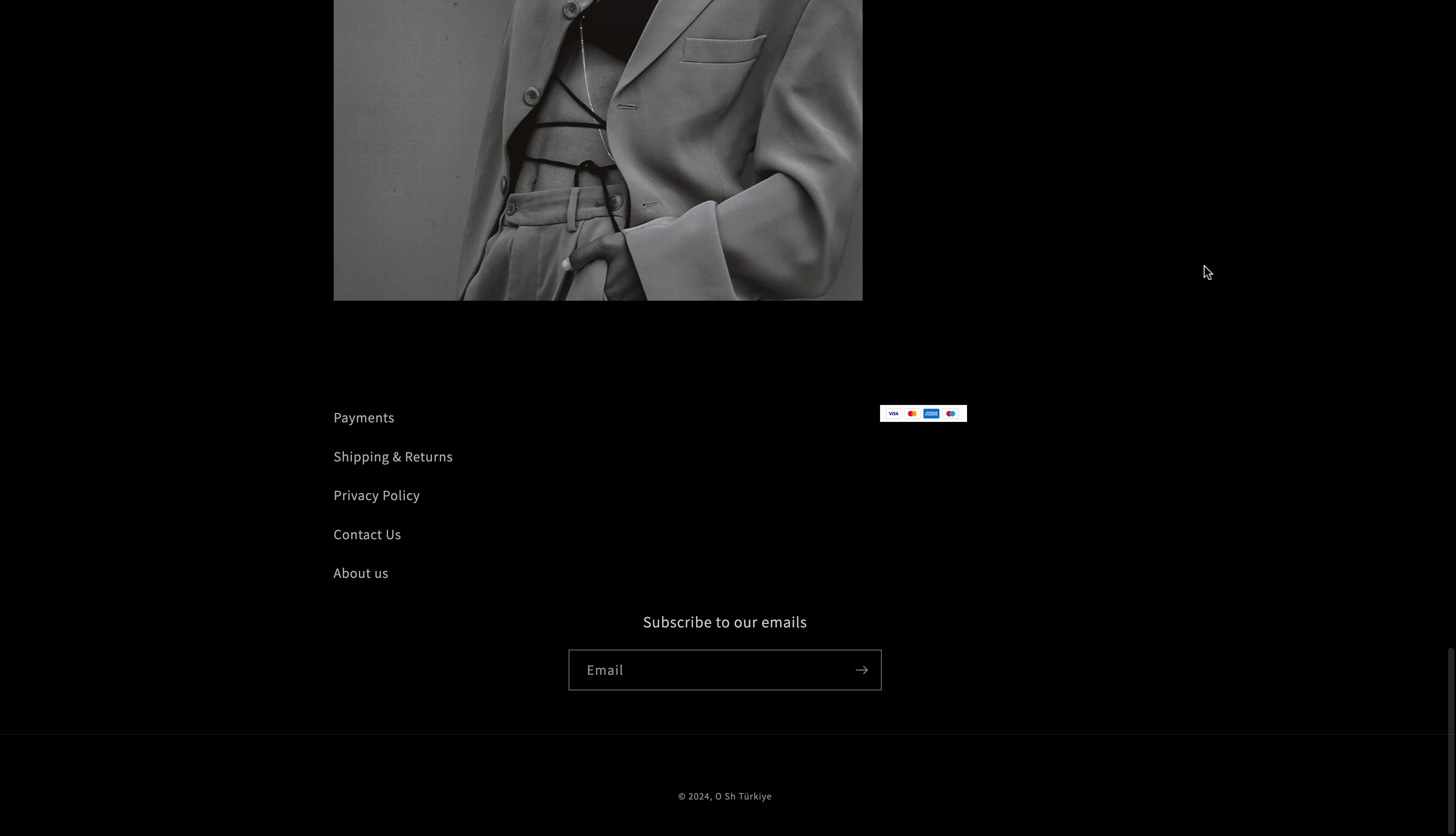
Newsletter Subscription: At the bottom, there’s a section inviting users to subscribe to the newsletter. This is crucial for customer retention and engagement, keeping visitors updated with the latest products and offers.
Footer: Includes essential links like contact information, policies, and social media icons, making them easily accessible without navigating away from the home page.
Final Conclusion
Key Achievements:
- Modern and Elegant Design: The new website features a contemporary, minimalist design that aligns with luxury branding. High-quality imagery and a monochrome color palette accentuate the jewelry's sophistication and elegance.
- Improved Navigation: Both desktop and mobile navigation were completely overhauled to be more intuitive. The desktop site utilizes a clean, easily accessible menu, while the mobile version employs a responsive accordion burger menu, ensuring that users can navigate the site with ease on any device.
- Enhanced User Experience: The redesigned website provides a seamless user experience across all devices. The layout is clean, making it easy for users to find information quickly. Product highlights and calls-to-action are strategically placed to guide users toward making purchases.
- Responsive and Mobile-Friendly: Special attention was given to mobile responsiveness to cater to the increasing number of users shopping on their smartphones. The mobile site is fully optimized for various screen sizes, maintaining functionality and design integrity.
- Effective Branding Consistency: The redesign upholds a consistent branding strategy across all pages, reinforcing the brand's identity through uniform typography, colors, and visual elements.
This case study documented the comprehensive redesign of a jewelry store's website, emphasizing a modern, luxurious, and user-centered approach to enhance both aesthetic appeal and functionality. The project tackled numerous challenges associated with the old website, including outdated design, poor navigation, lack of responsiveness, inconsistent branding, and slow loading times.